EXPERIMENTING WITH AUDIO VISUALS
Since I was struggling with my experiment, I asked help from Andreas. After scrutinizing my circuit, he promptly inquired about the resistor I had incorporated. It turned out that I had chosen the wrong resistor, and that was the sole reason my capacitive sensor wasn't functioning correctly. The power of resistors—pun intended—had a significant impact. I required a resistor with at least 1 megaohm resistance, and Andreas graciously let me borrow the correct one. Subsequently, everything fell into place seamlessly. While I was relieved that the conductive paint wasn't a scam, I couldn't help but feel a bit foolish for not identifying such a simple issue on my own.
My initial thought was how can I use audio or sound to create a sense of place or visuals audio/sound to create a sense of place.
VISUALISING AUDIO/SOUND
I looked for some reference before I jumped on TouchDesigner.
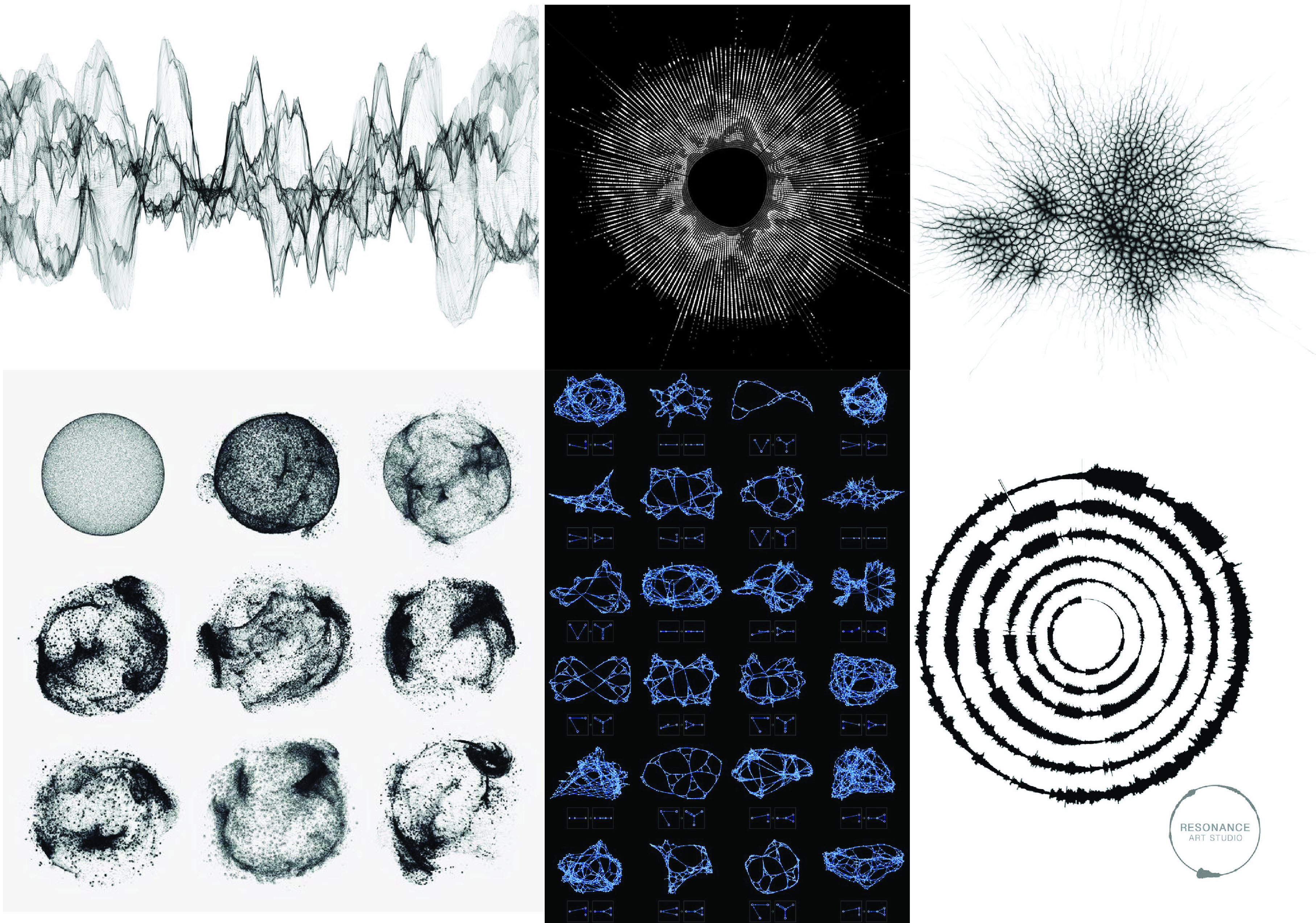
Quite intersetingly I found that a lot of existing projects that worked with visualisng sound, specially for data collection had a very particular execution. Most of it was represented in either some form of graph or pie charts and they had a very particular aethetic to it. To be honest I can not understand why this particular aesthetic?
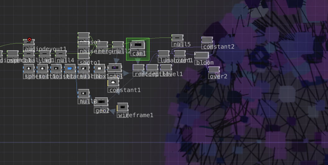
For this experiment, my initial concept involved using a song, 'Motley Crew' by 'Post Malone,' and creating visuals based on its synths and beats. I selected this song because I believed it had compelling beats and synths that would provide interesting textures for visualization. In the execution, I aimed to present the visualizations in the format of a box, where the beats appeared to be attempting to break out of the confines of the box. The intensity of the beats corresponded to the loudness of the texture, creating a dynamic and engaging visual representation.
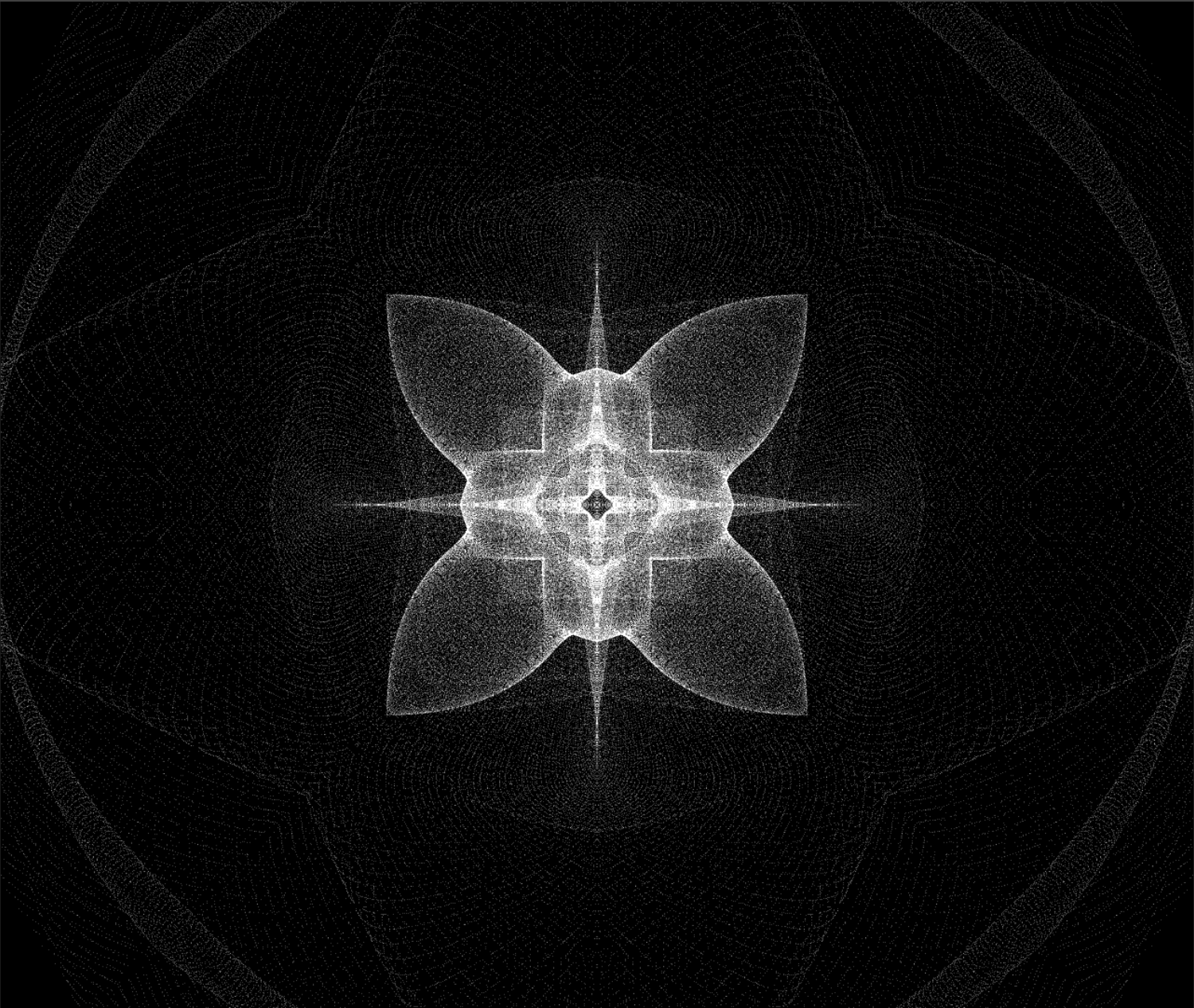
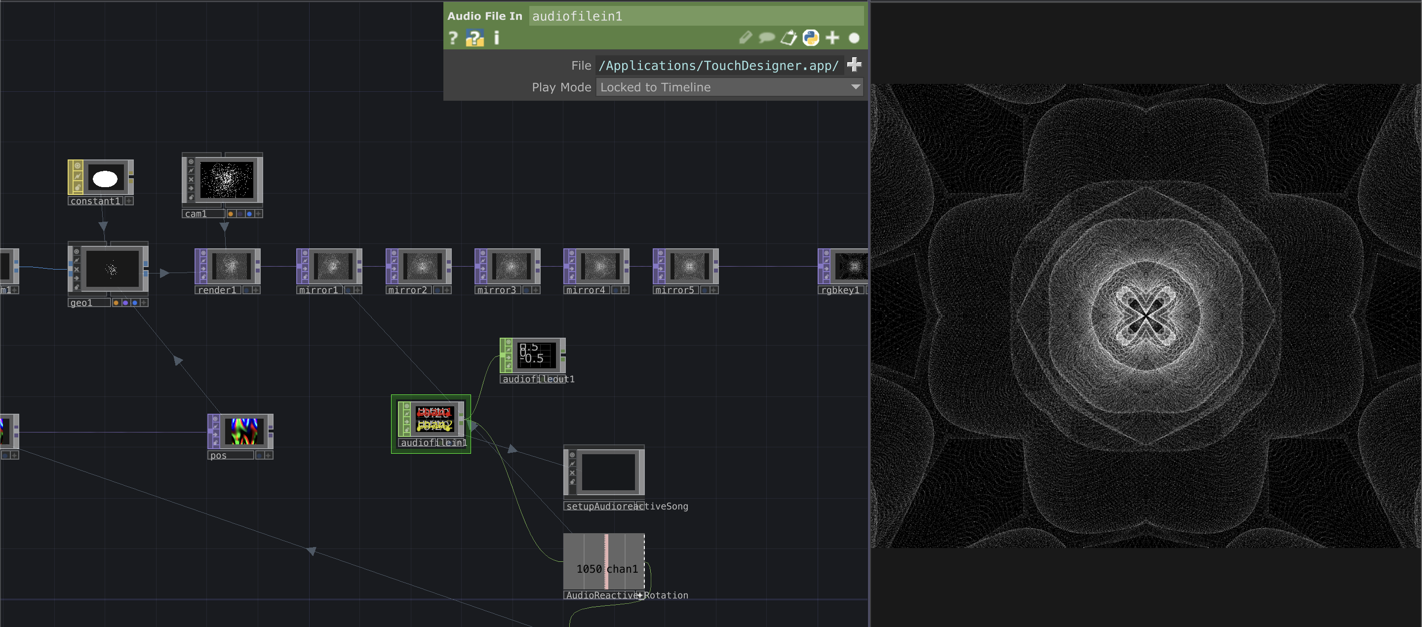
Touchdesigner has its own limitations, so I was working with a limited colour palatte and it gave me a particular aesthetic as well and I was not really fond of that, so tried changing the visuals to make it look more appealing and intricate.


