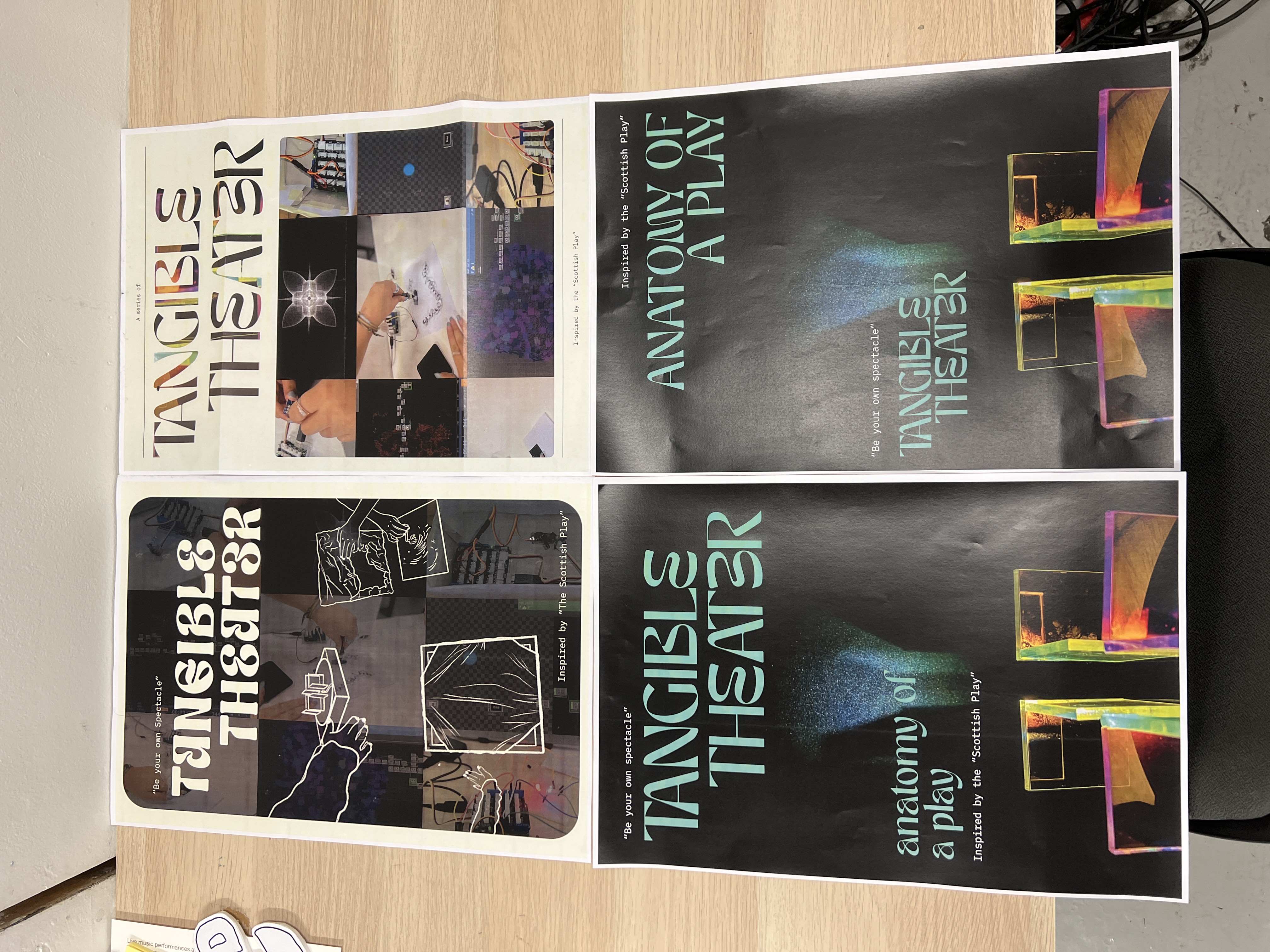
After considering the feedback from open studio, I realised I needed to revise the design of my pamphlets to ensure a cohesive branding. Although I was initially fond of the existing designs, I understand Andreas's perspective that they could be improved upon. And I was dreading this because making layouts is something i do not enjoy.
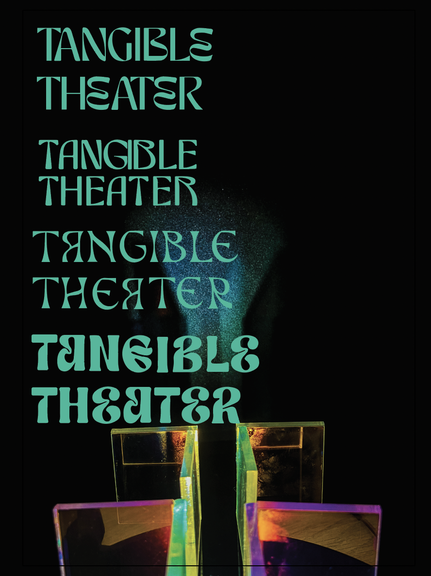
I started by designing two posters, which I initially thought were good. However, upon reflection, I realised that they didn't fit the overall aesthetics of my project. They were too bright for my taste. While I didn't mind the font choices, the overall design didn't align with what I wanted to convey. Medha even remarked that it resembled a Taylor Swift concert poster, which I found unintentionally offensive.
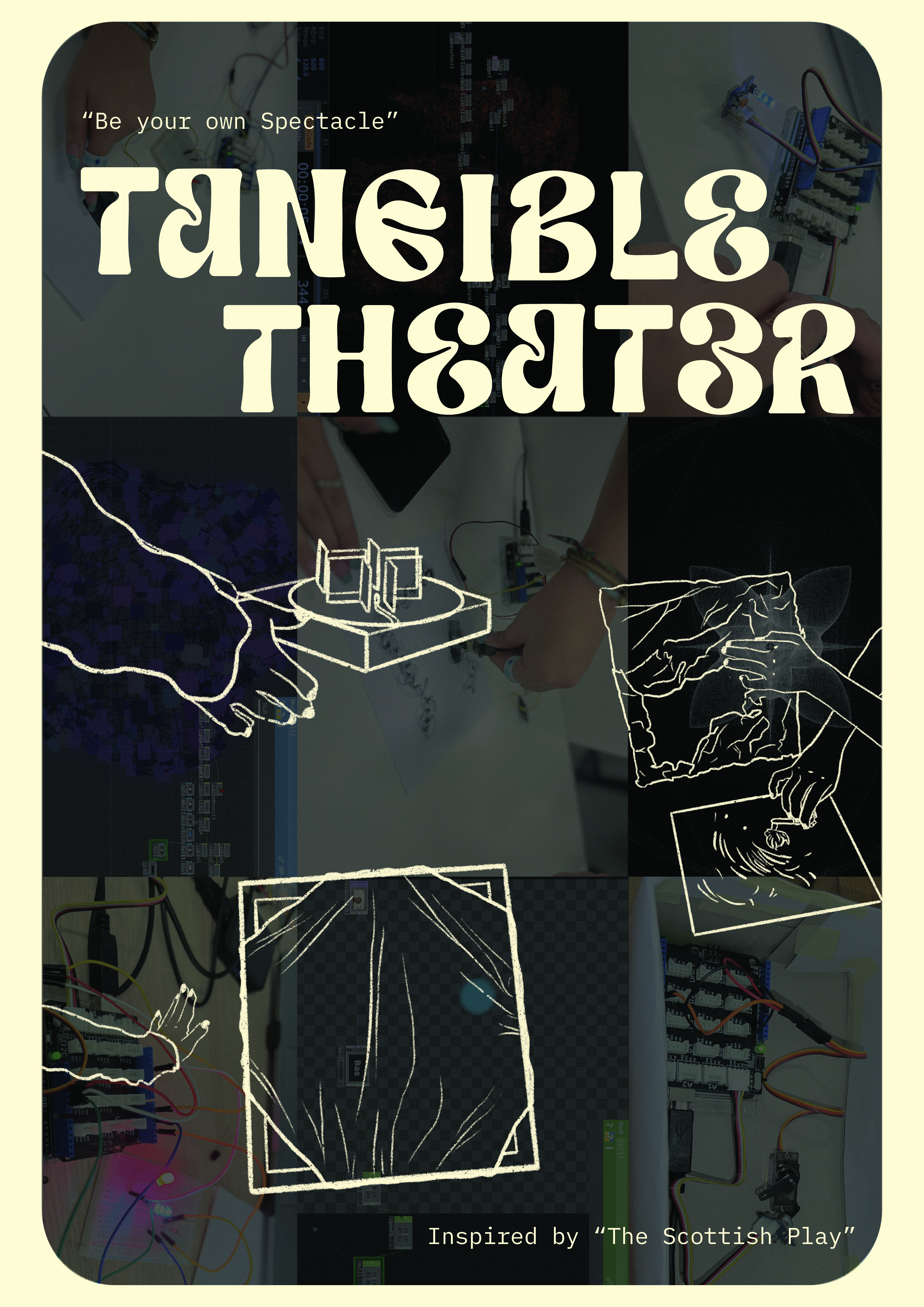
I conducted a vote with my friends to choose between the new design and the previous ones. Almost everyone preferred the art direction of the previous designs, stating that they suited my aesthetic better. However, they suggested that I could incorporate the font pairing from the new designs.
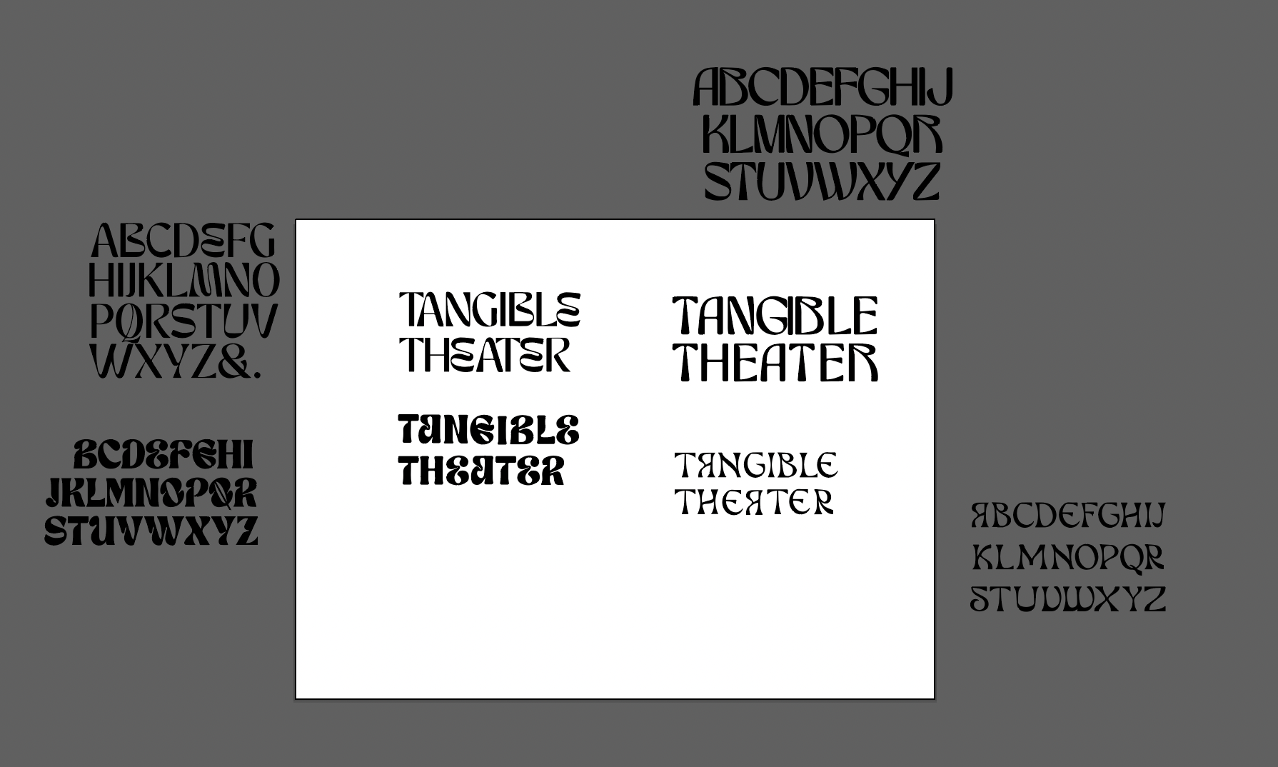
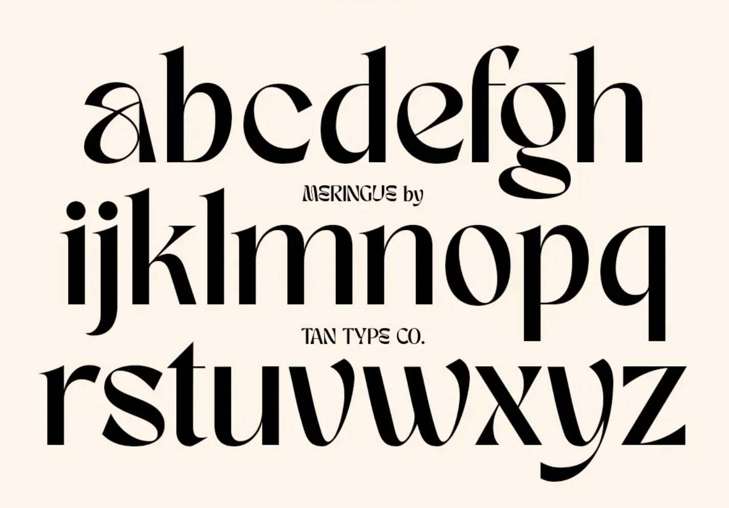
These were the heading fonts I had narrowed down. I found that IBM Plex Mono worked well as body text with all of these options, so I decided to use it c onsistently. Additionally, Mika pointed out that using IBM Plex Mono for body text gave the impression of a play script, which aligned with my project theme. Among the heading fonts, I liked all of them as they added a theatrical element when paired with my work. Ultimately, I chose "Meringue" by Tan Type Co. after finalising it against my key visuals.
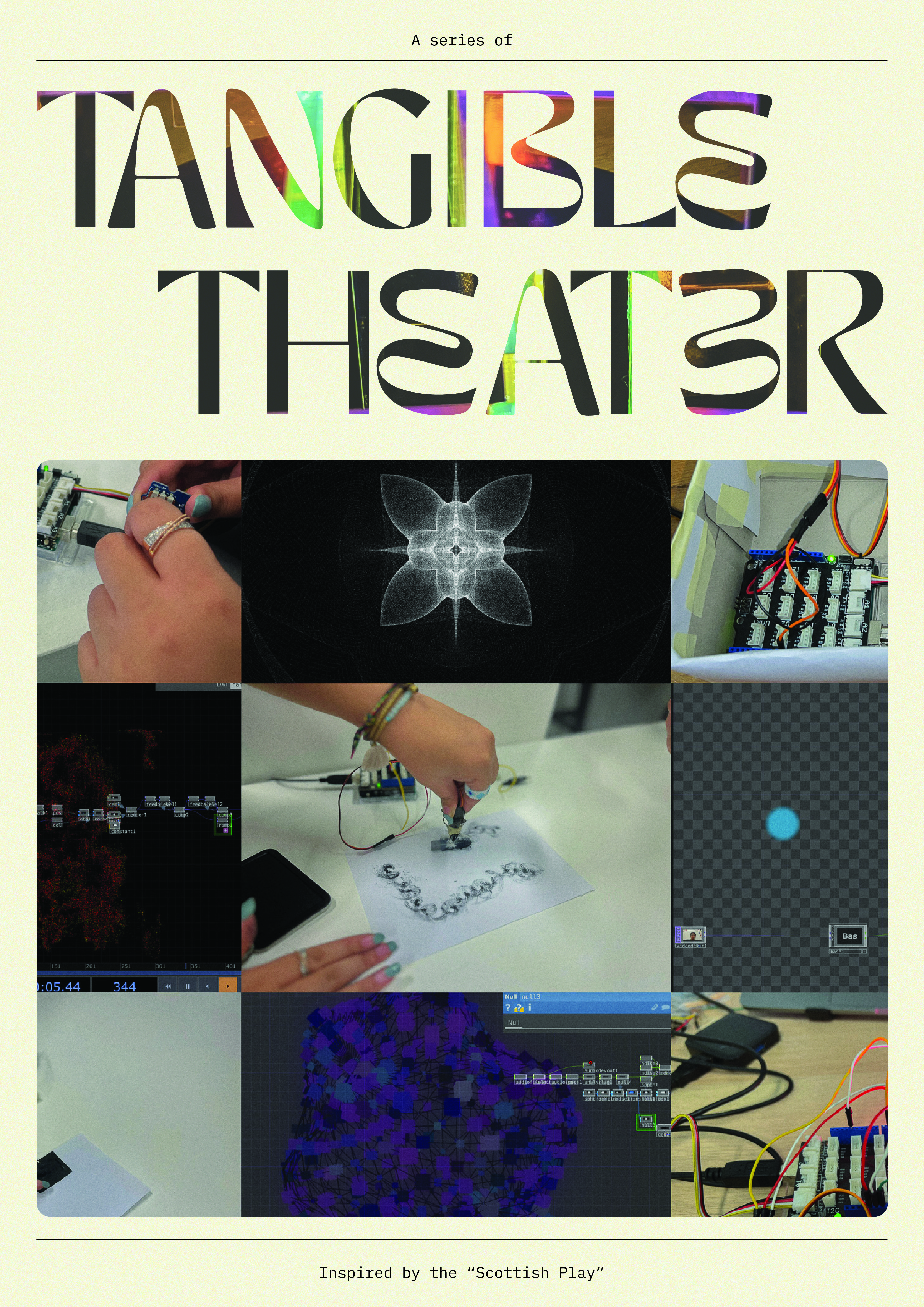
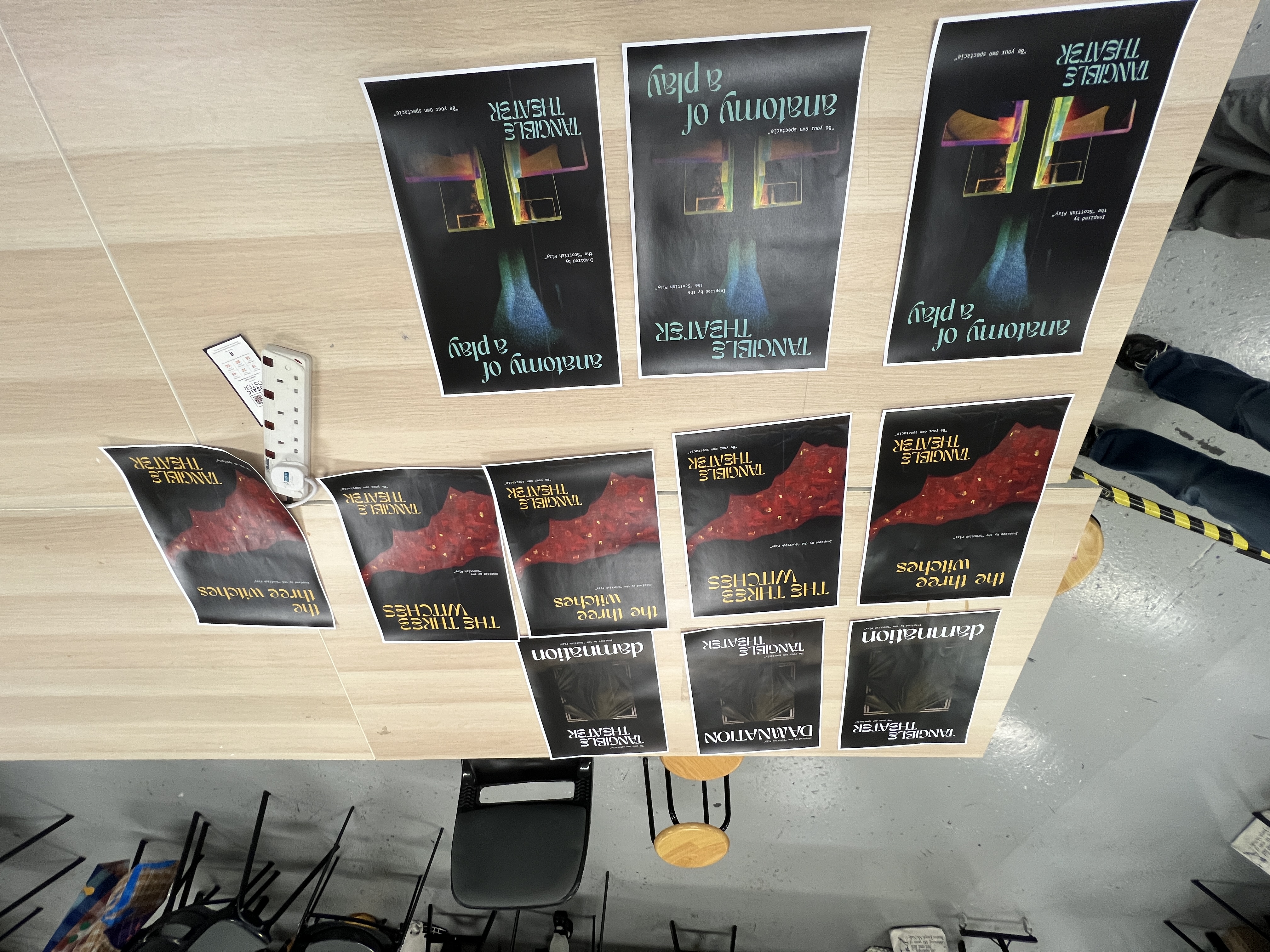
Completing my type setting, I began creating my posters, and it was one of the most challenging tasks I've faced. It took me over three days just to design three posters, which felt unreasonable. I found myself struggling immensely. By the end of the process, I had produced over 10 test prints for each of the three posters individually. Having so many options made it even harder for me to choose, so I resorted to the tried-and-true method of asking others in the studio to help me make the final decision.
In my consultation with Andreas, he pointed out that the inside of the poster seemed overwhelming and distracting. Considering his feedback, I decided to exclude the web-based catalog from my prints, as I already had it available online. Instead, I opted to include a painting I am referencing, depict the scene I am referencing, and provide a bit of context about the artefact on the back of the poster. This adjustment would make it easier for others to understand the artefact.
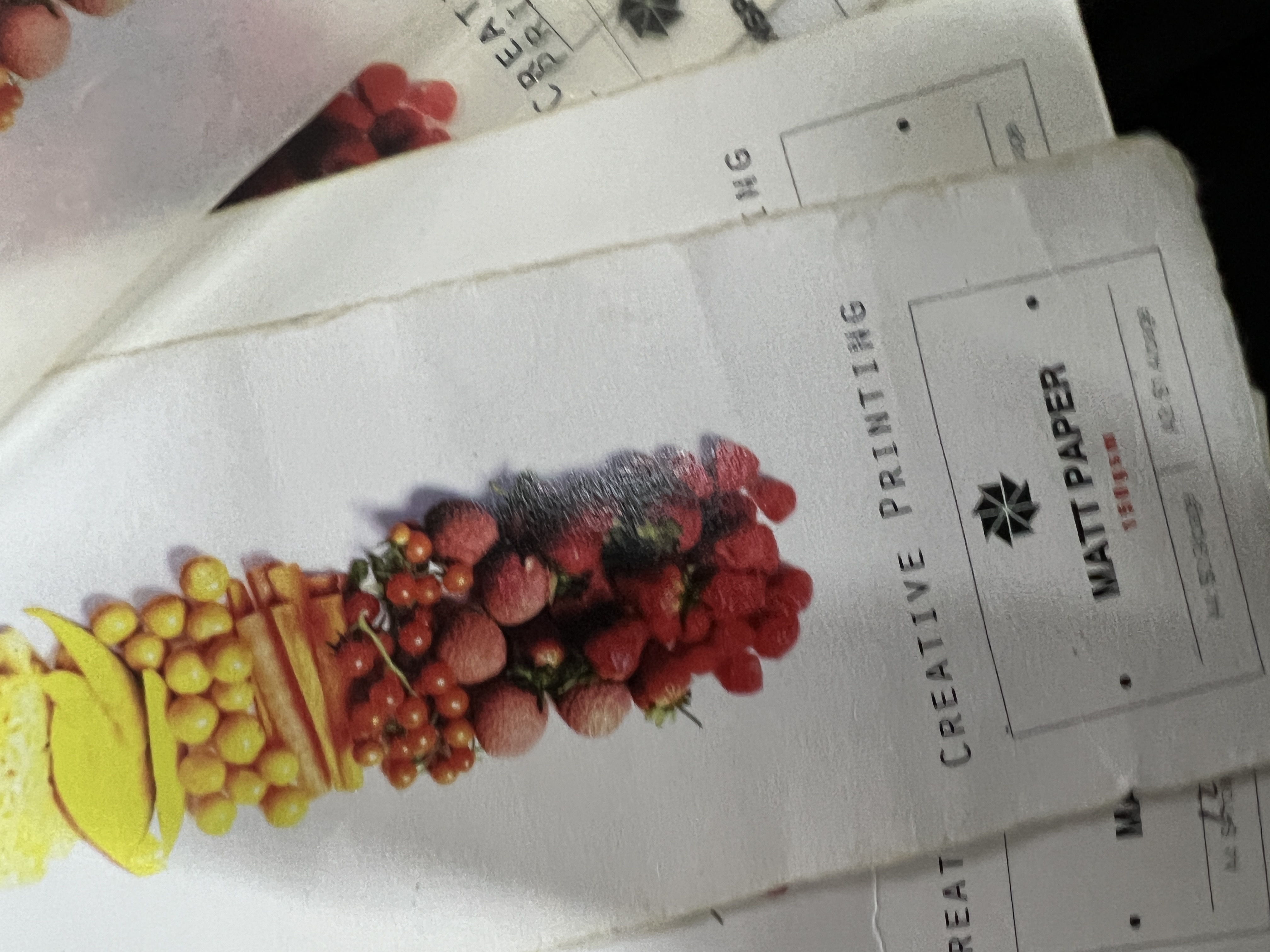
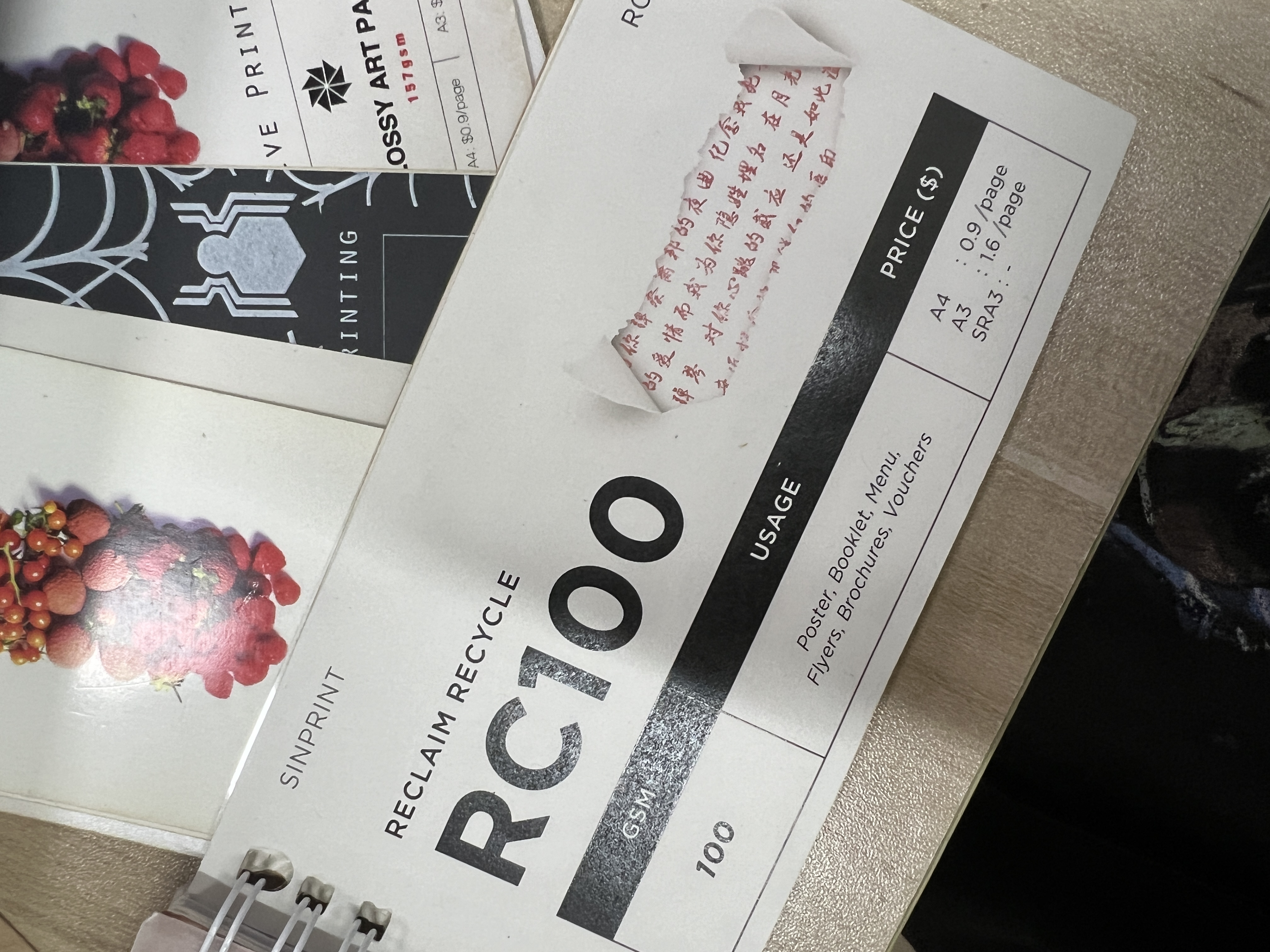
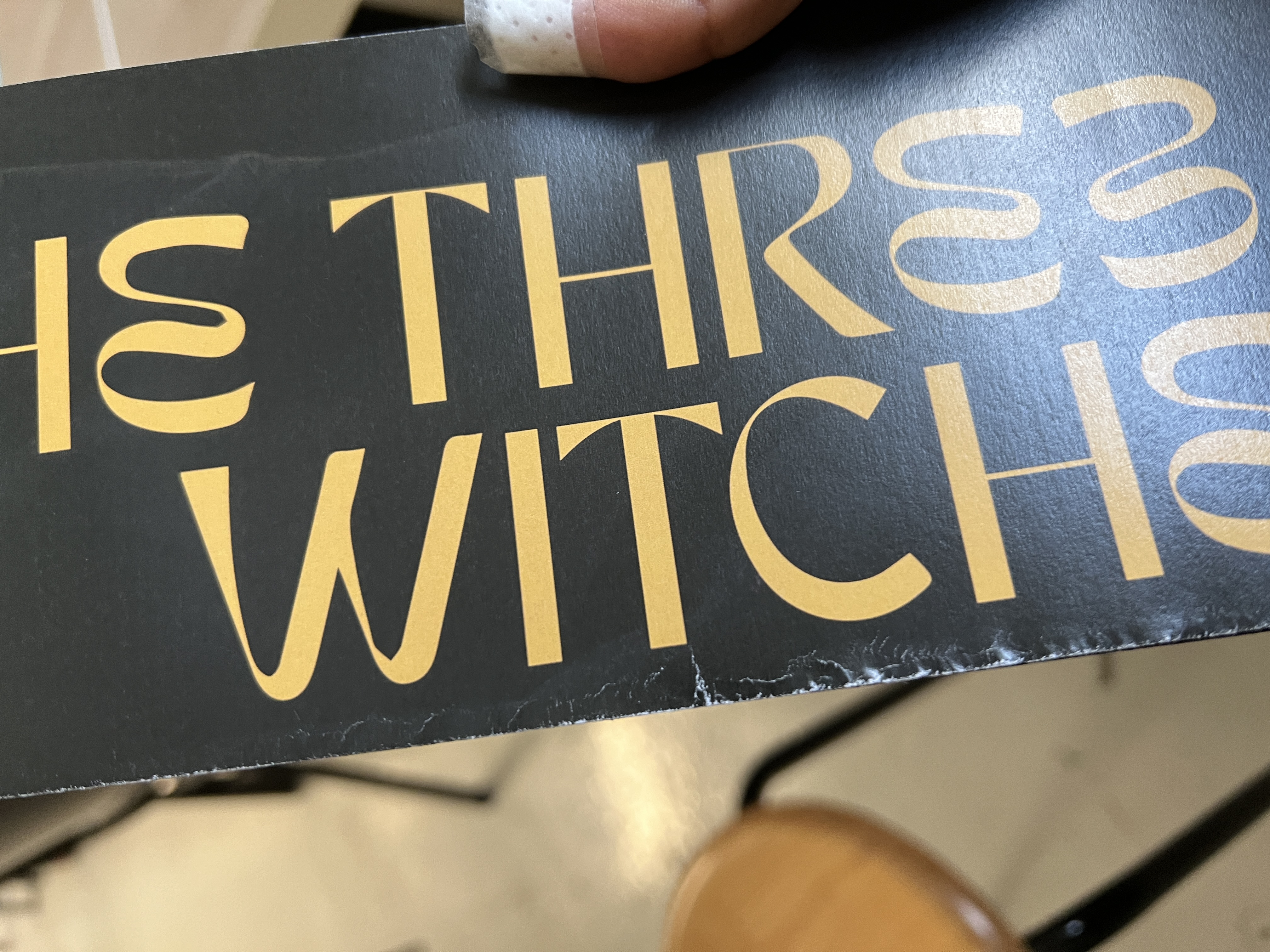
Originally, I intended to print on maple snow paper due to its white appearance. However, after getting the final prints, I noticed that it had a glossy finish, and when folded, the paper showed white creases, which was not aesthetically pleasing. Therefore, I did test prints on other sheets and ultimately chose Reclaim Recycle 100. Although it also had some white creases when folded, they were less noticeable compared to maple snow. Additionally, the printing staff informed me that almost every paper would show creases due to the black background.