FINAL PRINTS
I found the final prints much more appealing compared to the earlier versions. Simply changing the type choices made a significant difference. While these prints are relatively simple, they definitely look better than the initial ones.
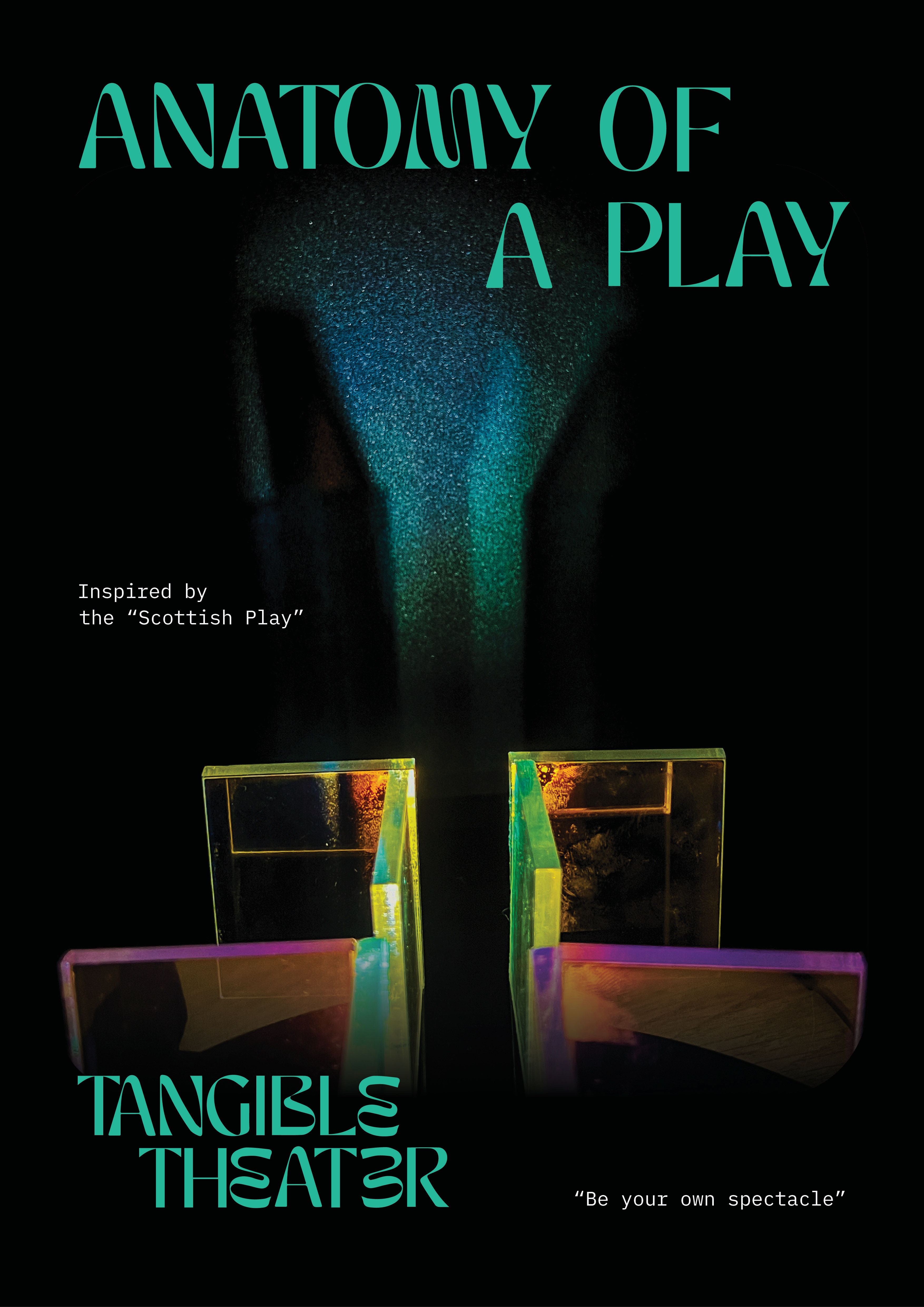
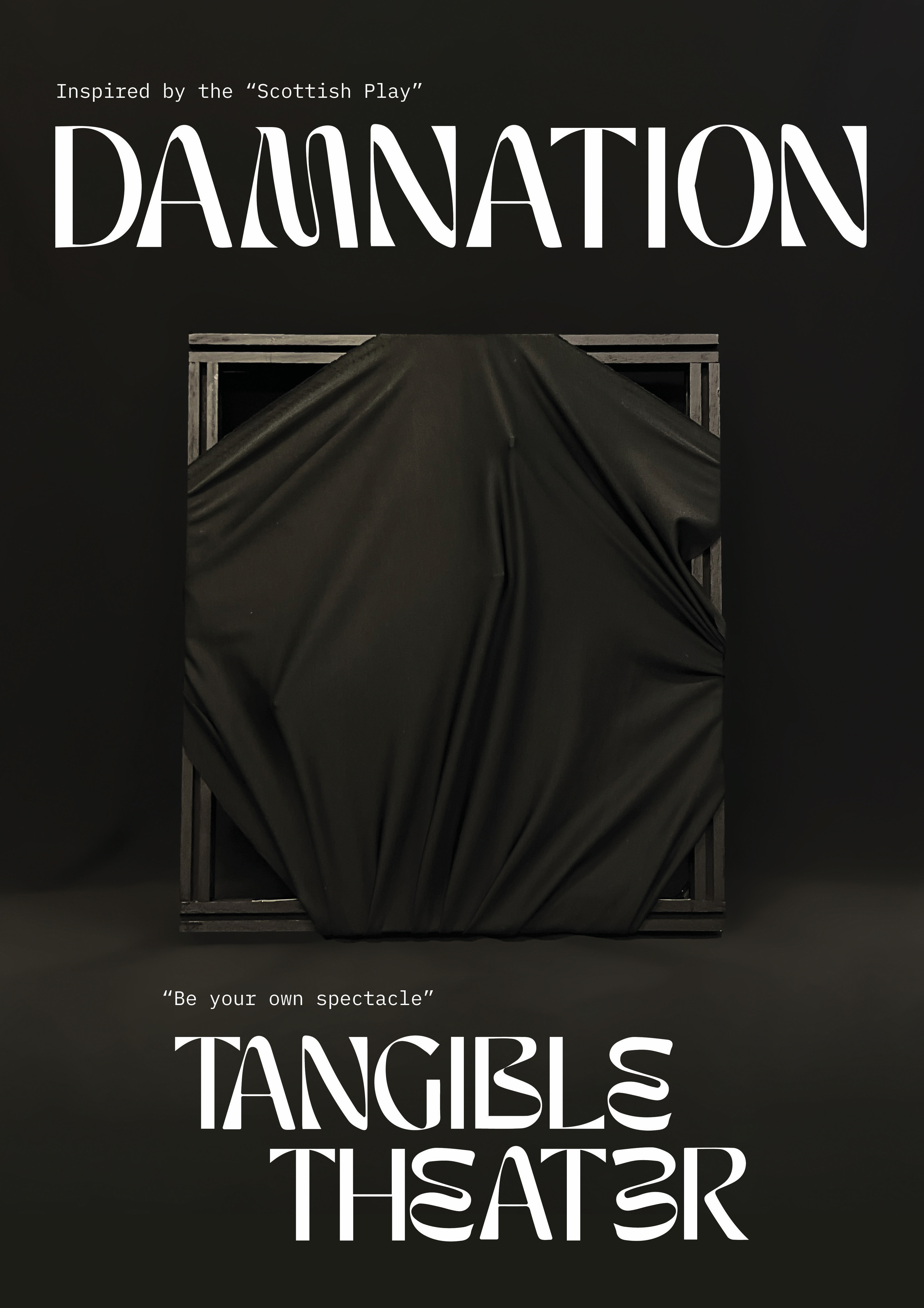
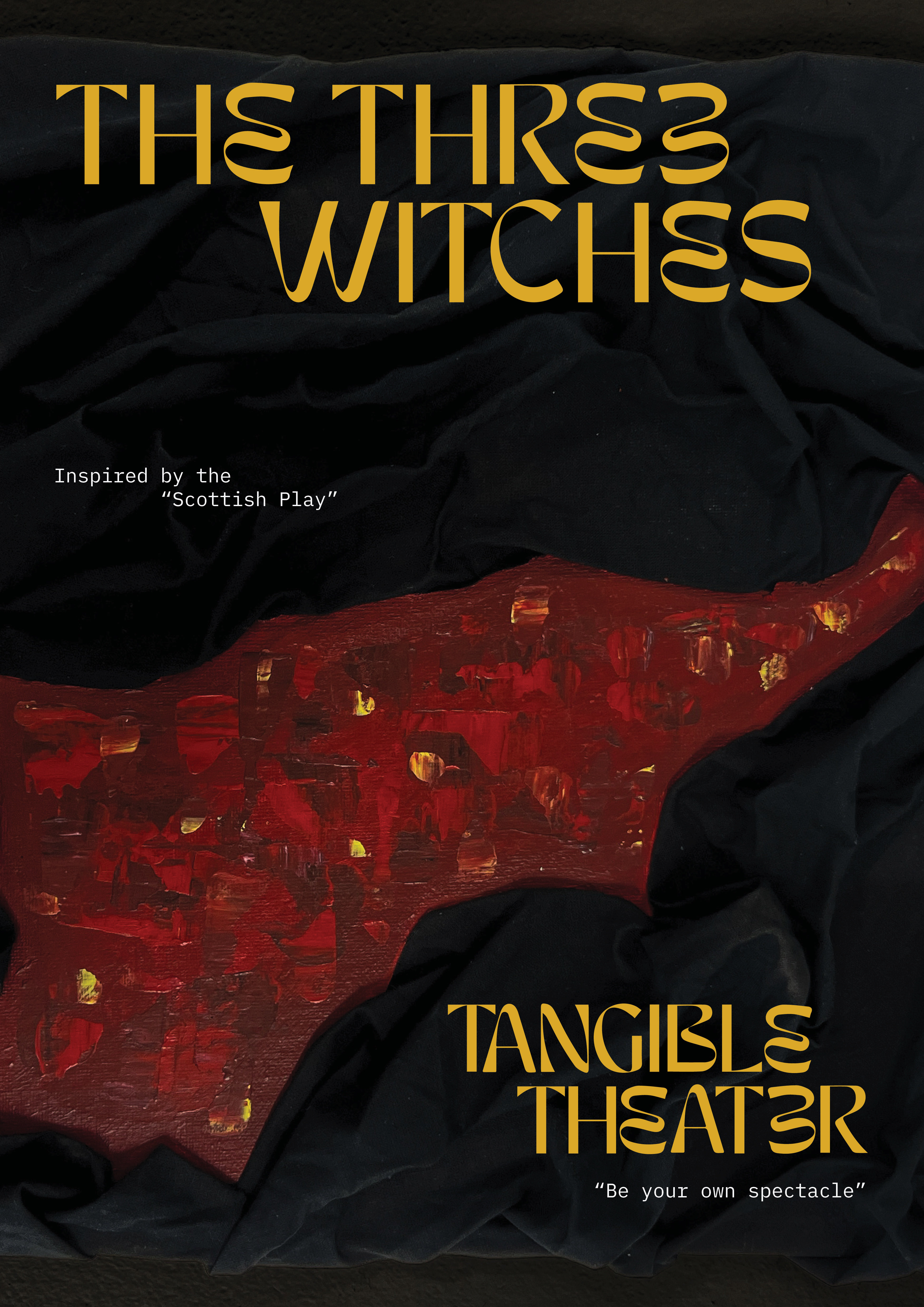
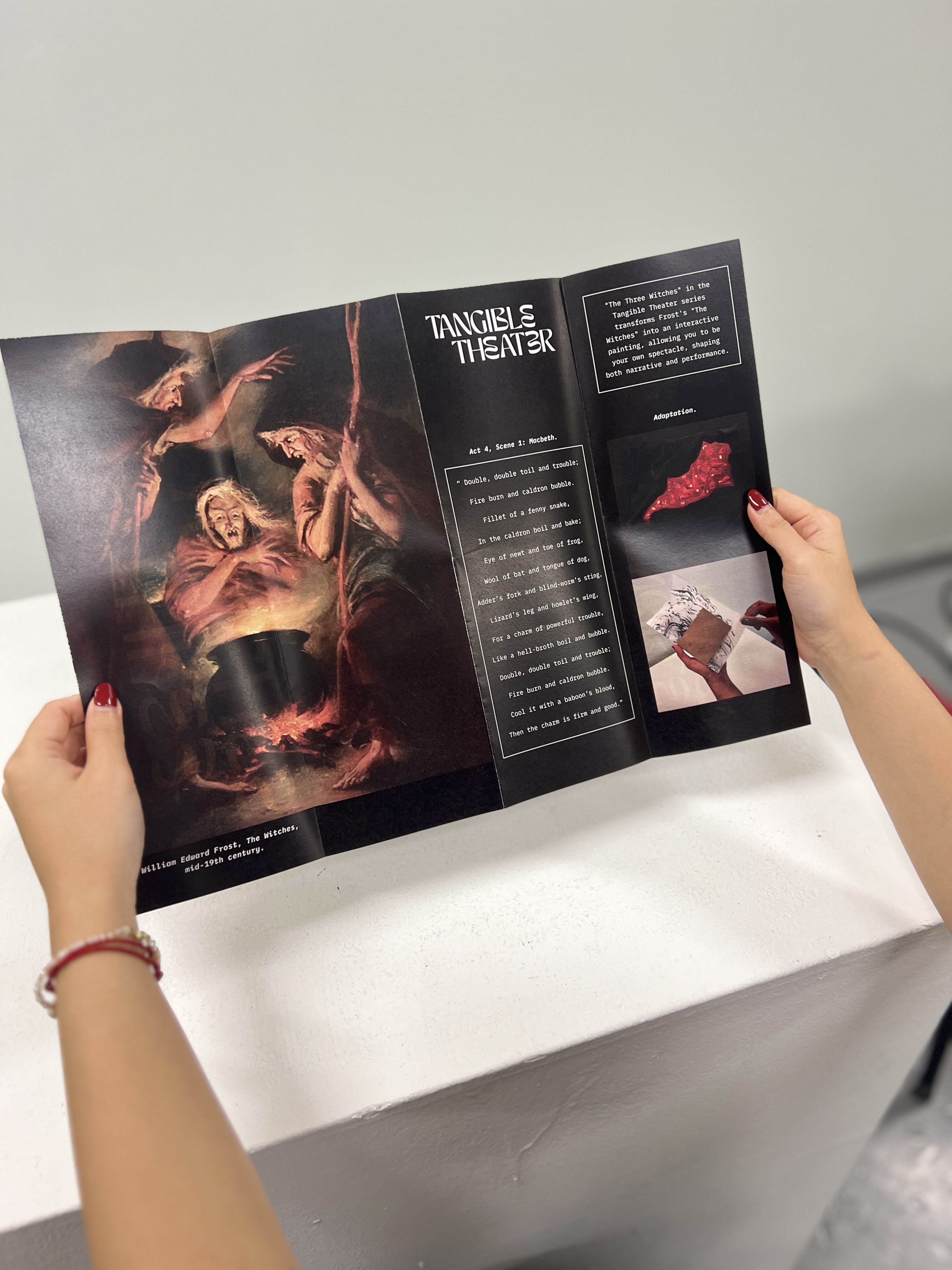
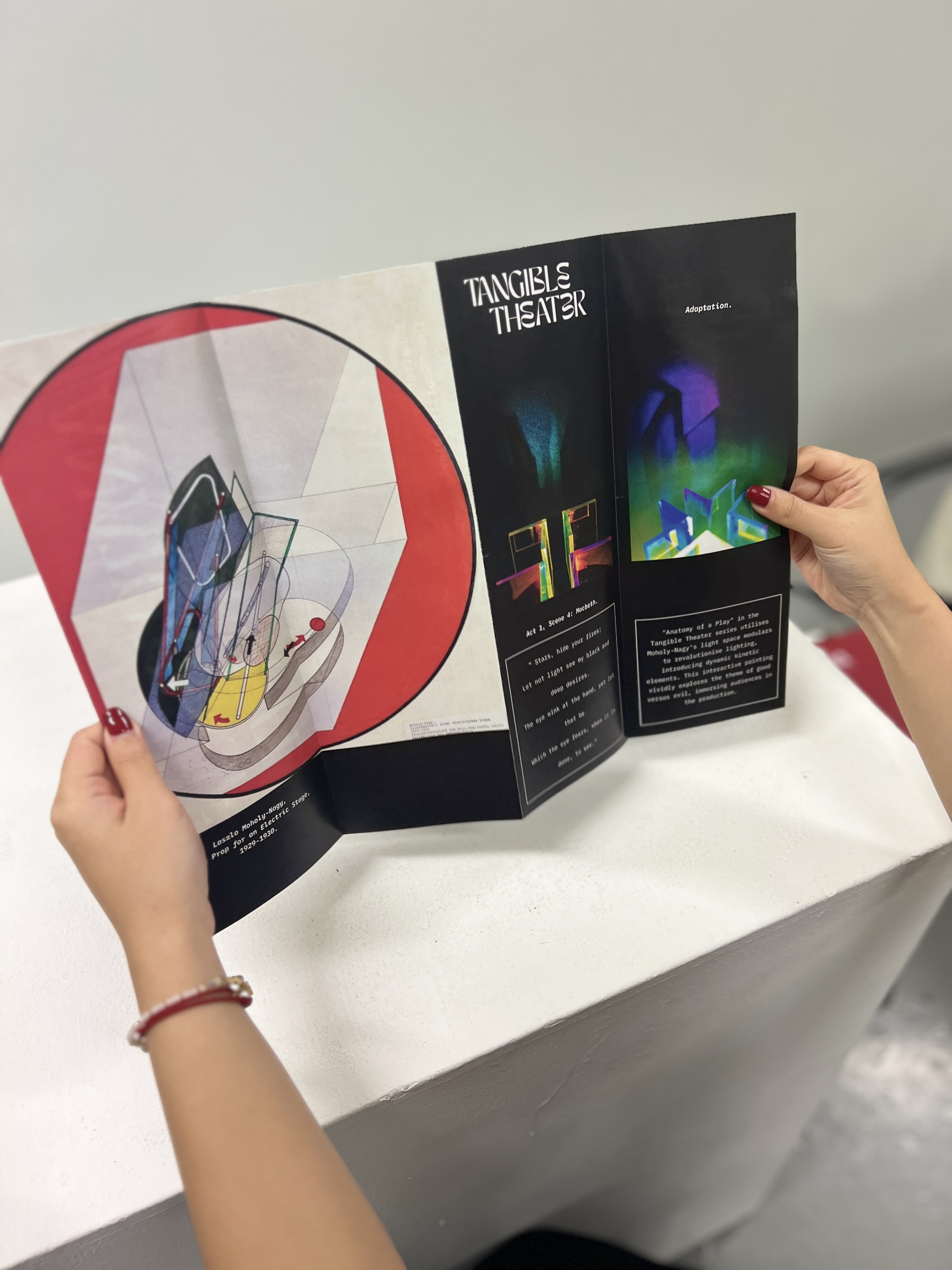
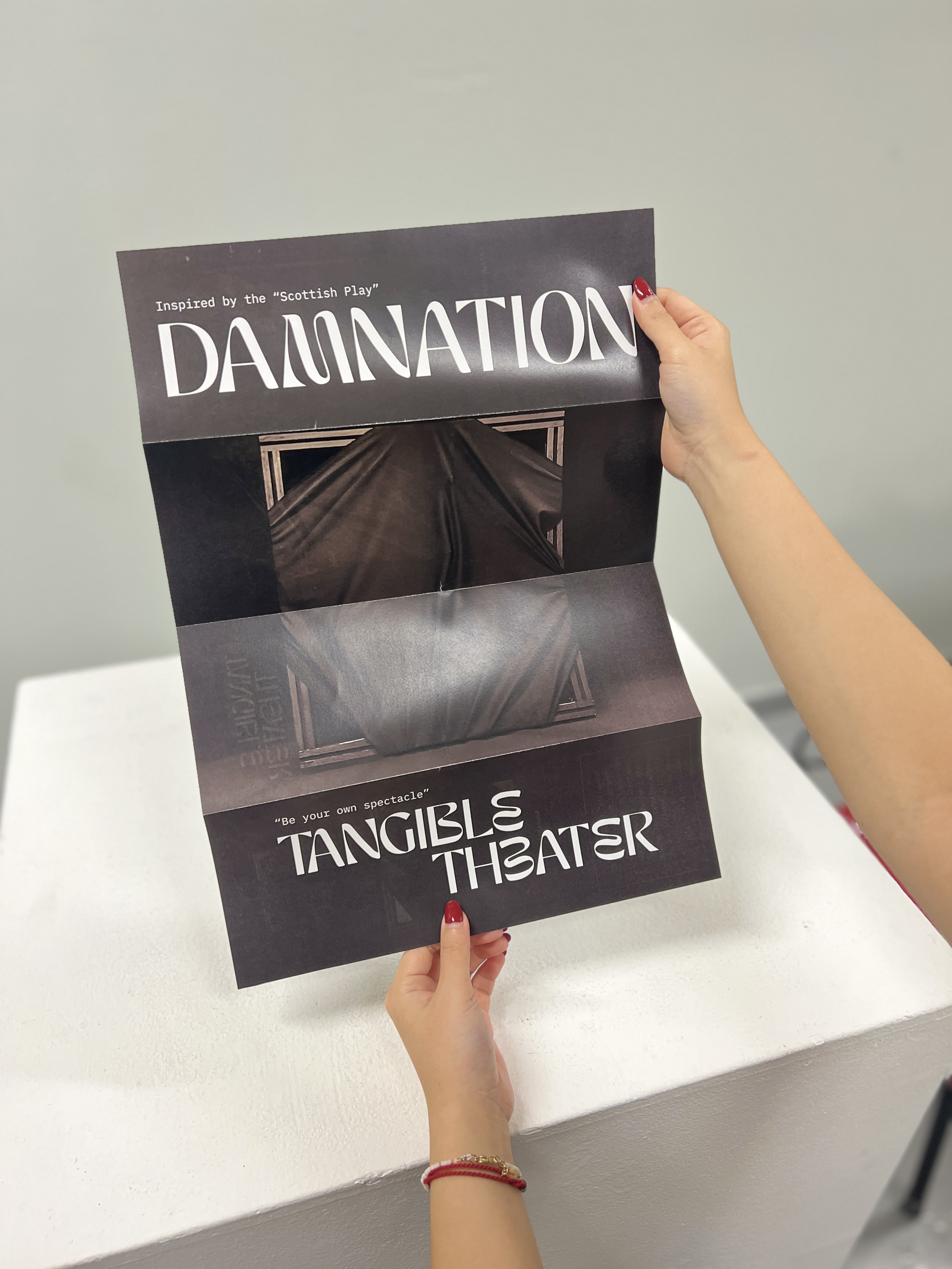
I found the final prints much more appealing compared to the earlier versions. Simply changing the type choices made a significant difference. While these prints are relatively simple, they definitely look better than the initial ones.


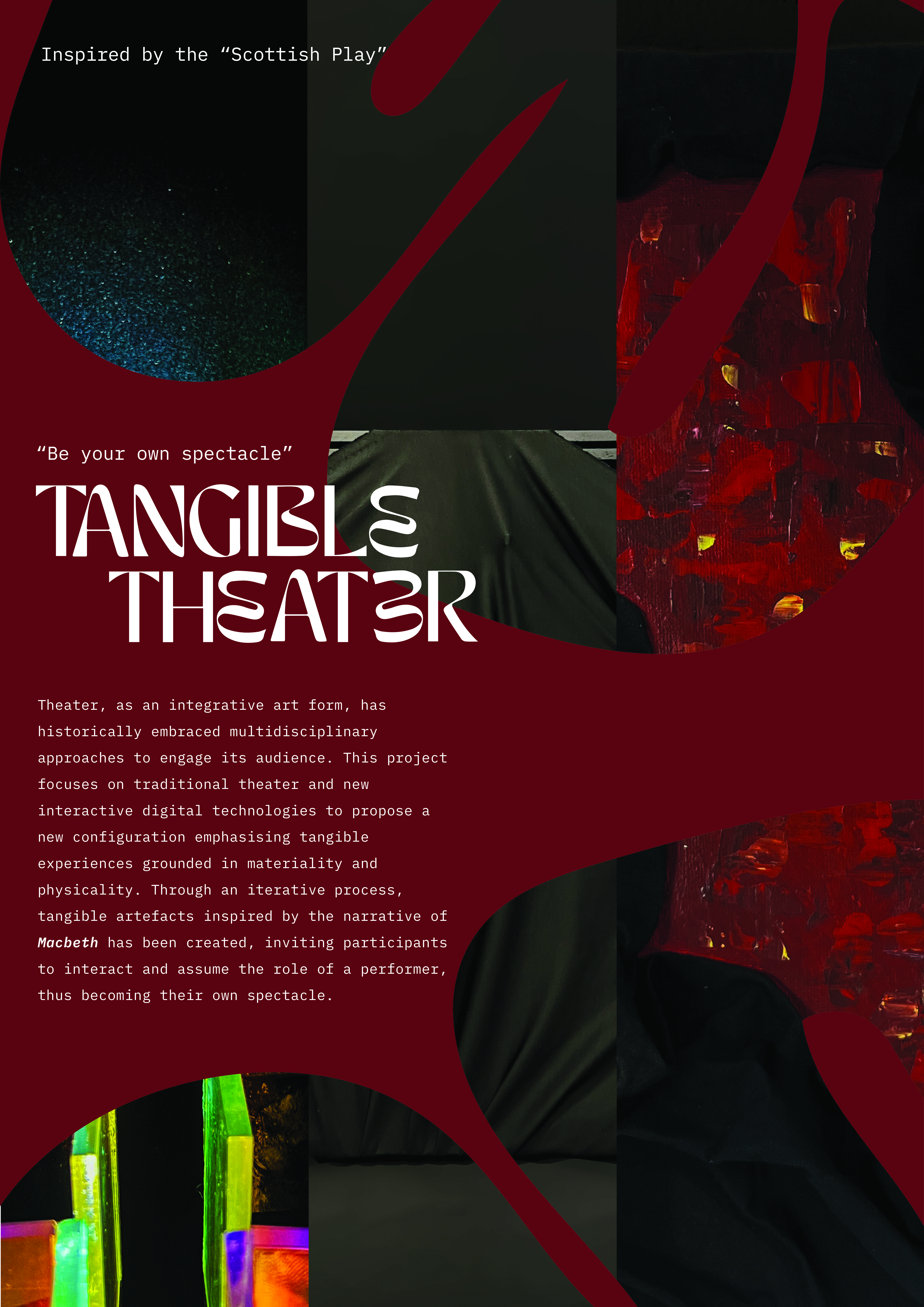
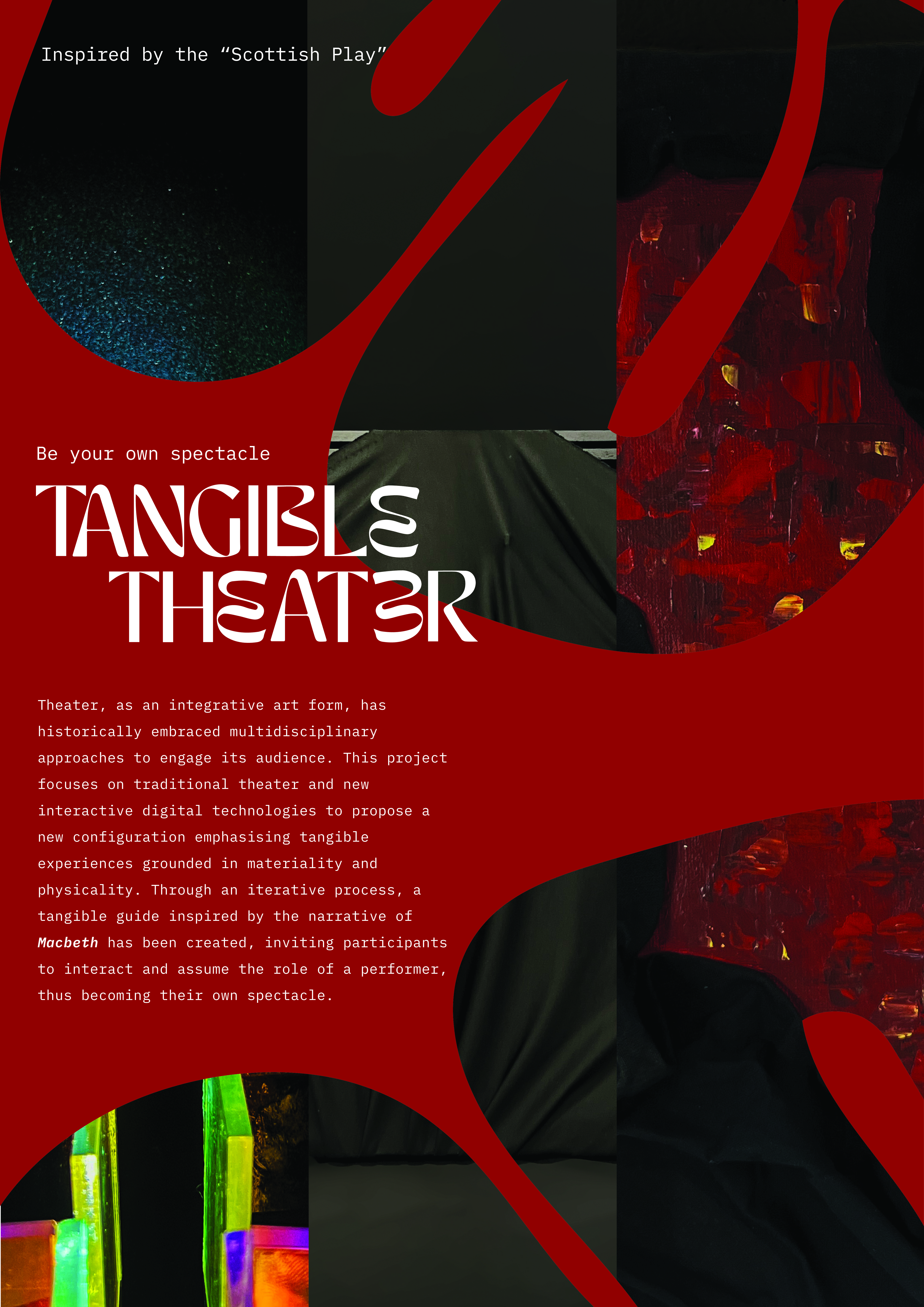
To create a final poster for the entire project, I opted for a simple layout. I incorporated the tangible theatre type logo I had created and extended its "e's" to accommodate an image. I also included my design statement. Instead of a black poster, which was becoming repetitive, I chose red as it was another common color used in my project.
I was debating between these two shades of red and ultimately decided to go withthe darker version as it looked a bit more classier and matched the overall red used in my artefacts.
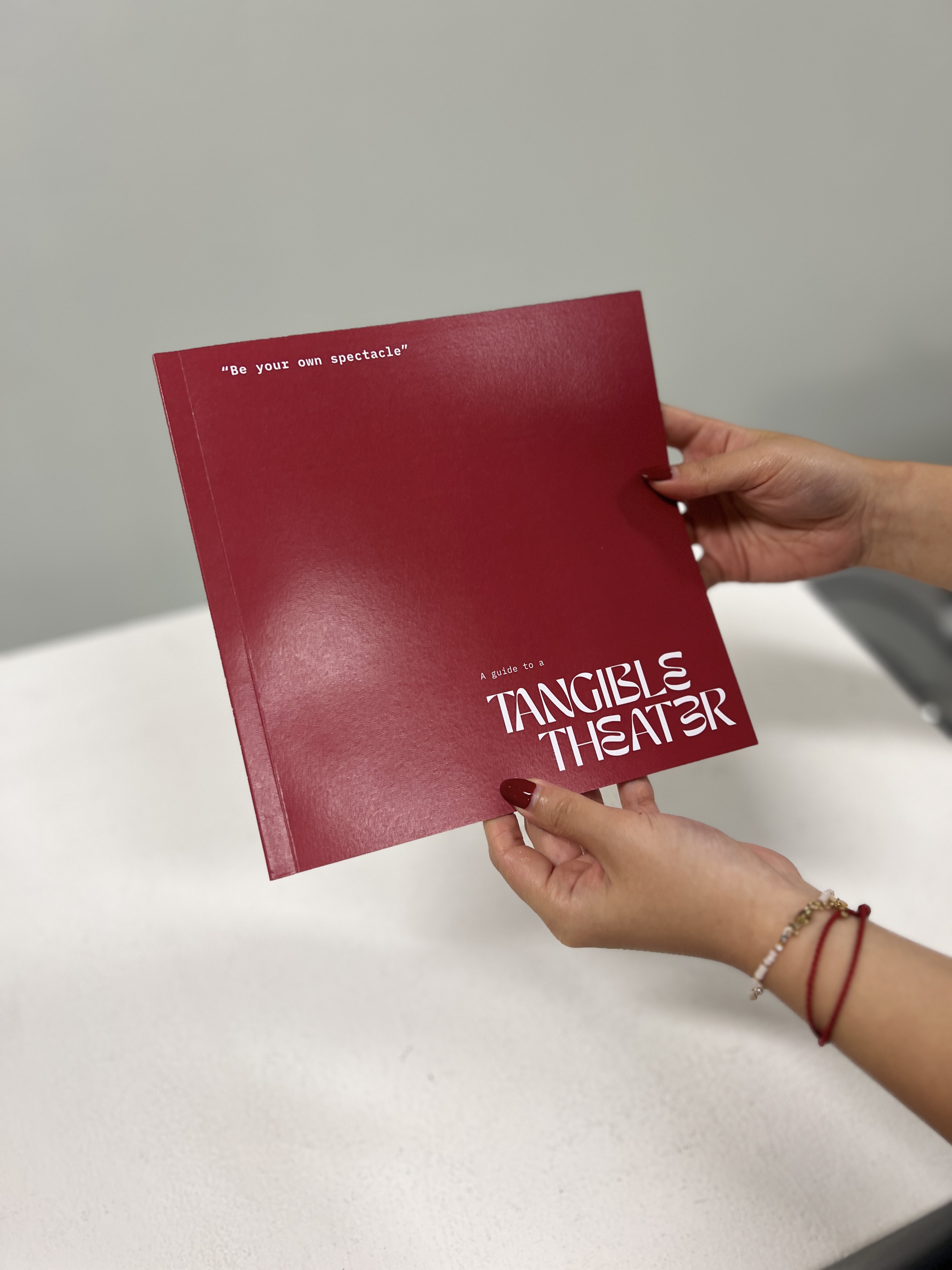
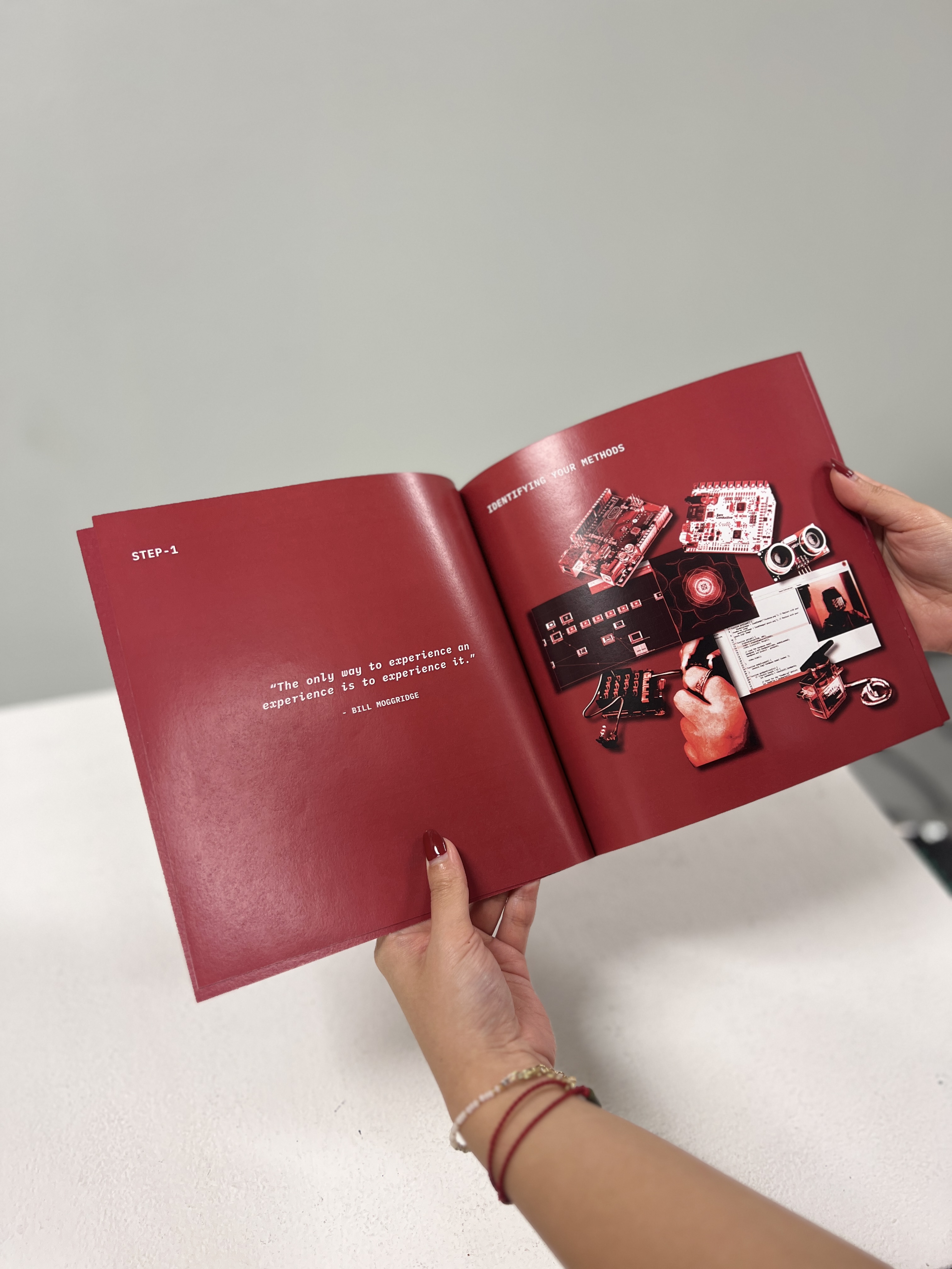
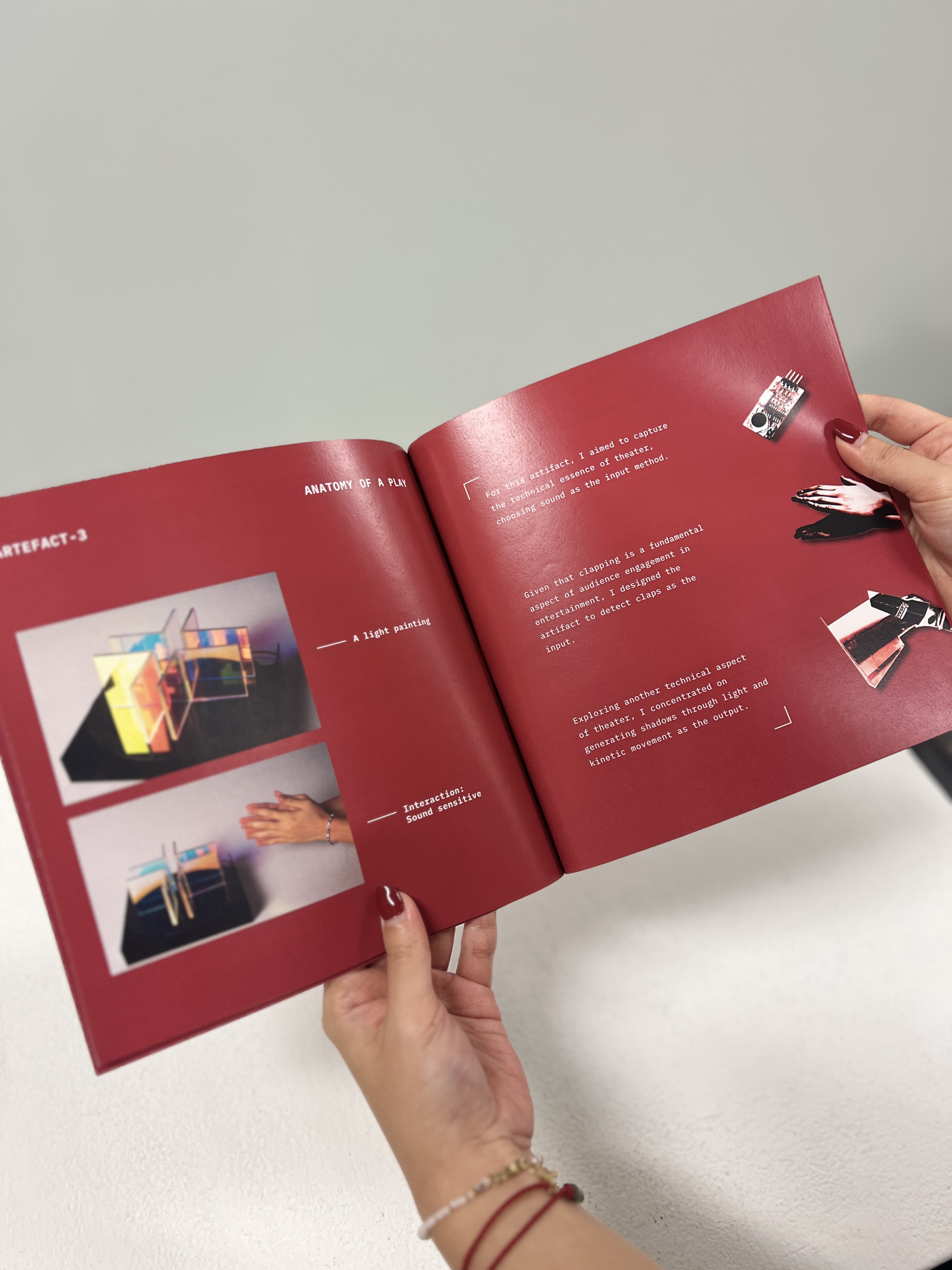
For another print deliverable, I created a guide on how to make a tangible theatre. Initially, I intended to make a toolkit, but upon reflection, I realised it was evolving more into a guide. Unlike a toolkit, which typically includes materials or products for assembling your own version, this guide focused on providing a method rather than physical components. It resembled an instructional manual akin to those provided with Ikea products.
To create the content for the guide on making a tangible theatre, I focused on ensuring it was comprehensive and not just a last-minute effort. I approached it as a step-by-step explanation of my own artefacts, using them as templates. The publication aimed to provide a detailed guide on how to make a tangible theatre by understanding the methods and techniques I employed. Each step was carefully explained, with emphasis on why it was important to provide context for readers.
For the aesthetics of the guide, I opted to maintain the use of red to ensure consistency with the other printed materials and prevent the main poster from standing out too much. As for the paper and binding, I chose maple snow because of its decent print quality and brightness, which made the photos stand out effectively. I had been eager to try a perfect bind for some time, so I decided to use this method for binding the guide. This choice provided a polished and finished look, contrasting with the raw aesthetic of my artefacts, and aimed to make the prints more visually appealing and desirable.
